Overview
For our second project in the Iron Hack UX/UI Design Bootcamp, we had to create an e-commerce website for a small business.
We chose to work with Pretty Random, an emerging brand that sells accessories with embroidered funny/ironic messages.
Scope
We had 2 weeks for this project to do user research, competitive analysis and brand analysis.
We were expected to deliver one user flow of the website in a device of our choice alongside designing only one responsive screen.
Team
I-Ling Shih
Vânia Pêgas
My role
Although we were all equally involved in the design thinking process and brand development, I took the lead in the design implementation.
The client
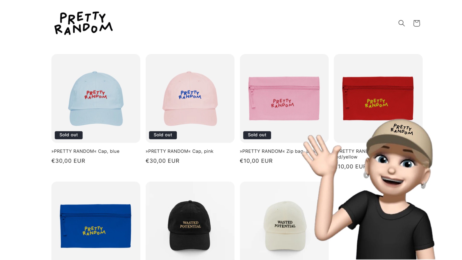
Pretty Random is the side hustle of Mina, a Berlin-based photographer. Her mission is simple: to bring joy to like-minded individuals who embrace a lighthearted approach to life.
When we met her, she shared with us her business struggles:
Shopify's limited customization options.
Lack of resources & energy for marketing.
The user
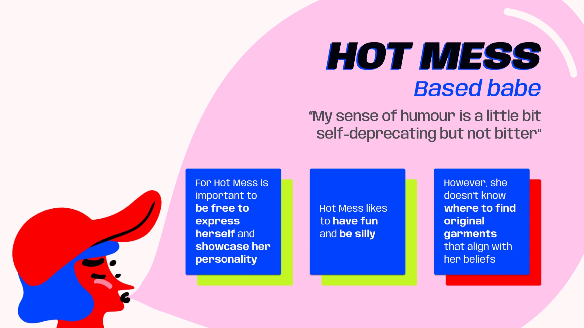
Urban Dictionary defines “based” as a way to describe someone confident, sassy, and unaffected by others’ opinions.
Our user persona, Hot Mess is the embodiment of that term. She is striding through life with style, cracking jokes, and never taking herself too seriously. Hot Mess cares about being authentic, having fun, and being silly.
How can Pretty Random
Our approach
Brand identity
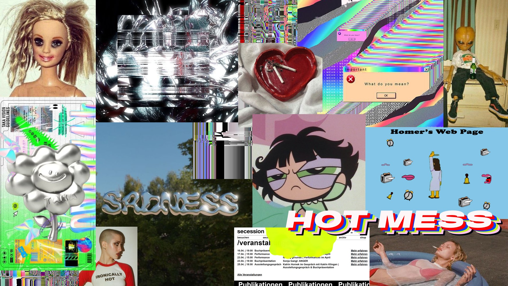
We asked Mina about her vision for Pretty Random and to describe it with adjectives. Combining her insights with our research, we crafted a moodboard representing a fun, playful and curated chaos.
We focused on collecting visual elements from brutalist graphic design and glitch art alongside pop culture and internet references to establish a visual common ground that conveys the irony behind Pretty Random.
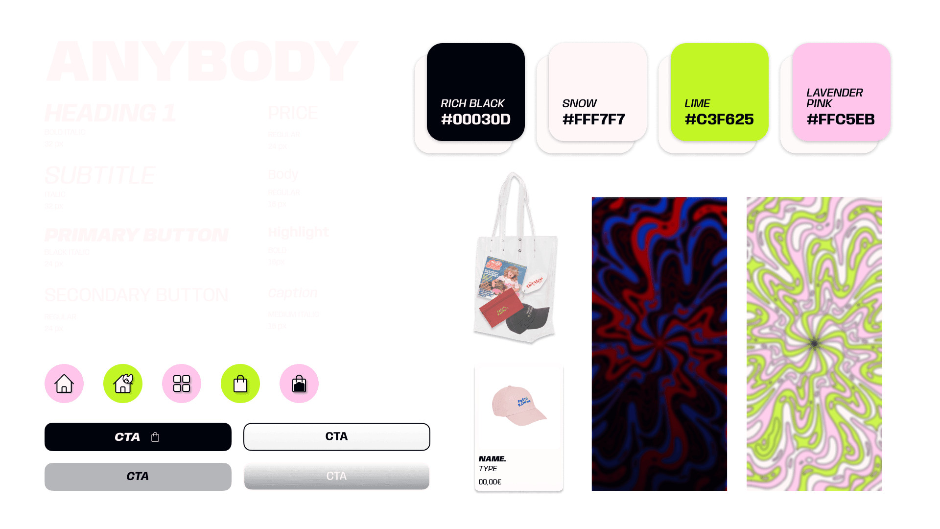
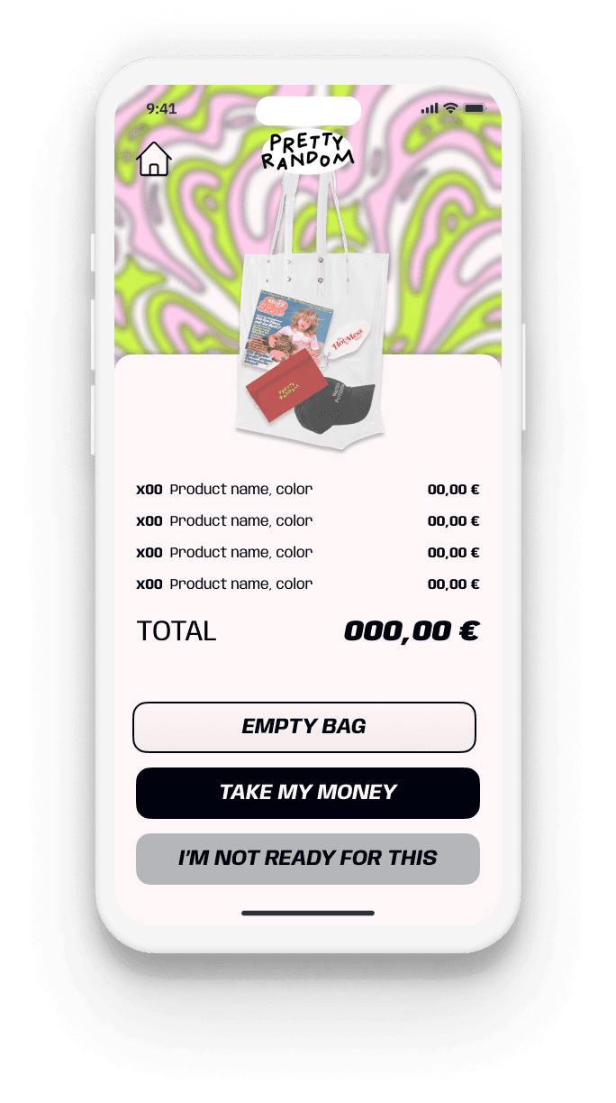
We aimed to balance the chaos of the home screen with down-to-earth My Bag and product screens to provide safety and reassurance to the users.
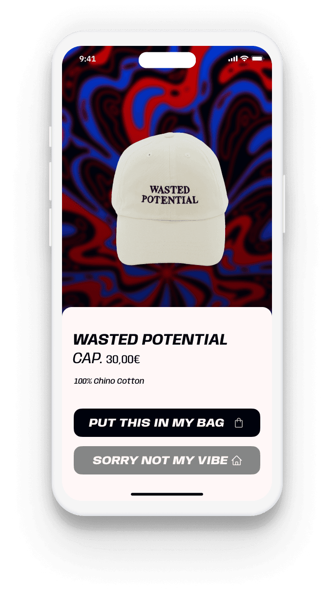
Engaging discovery
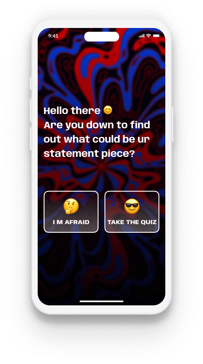
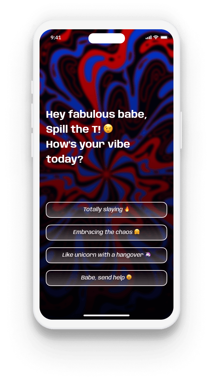
This process kicks off with a quiz to help our babes connect with the product.
The quiz will show users a different message and product based on their answers.
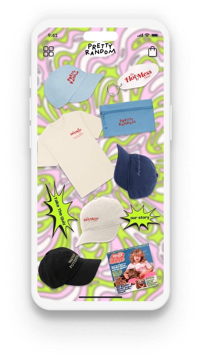
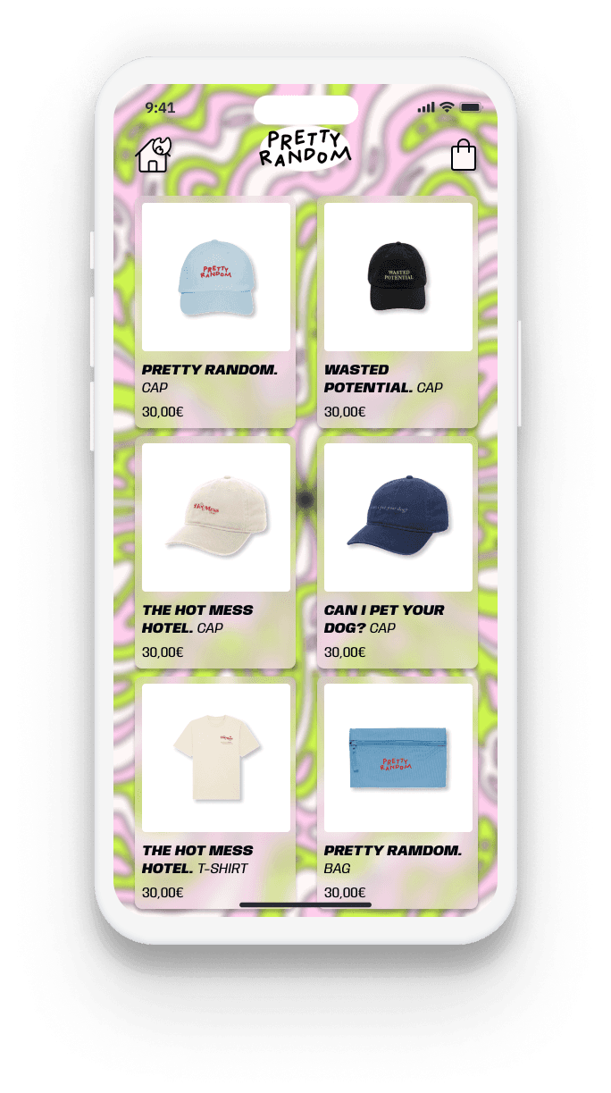
Home page
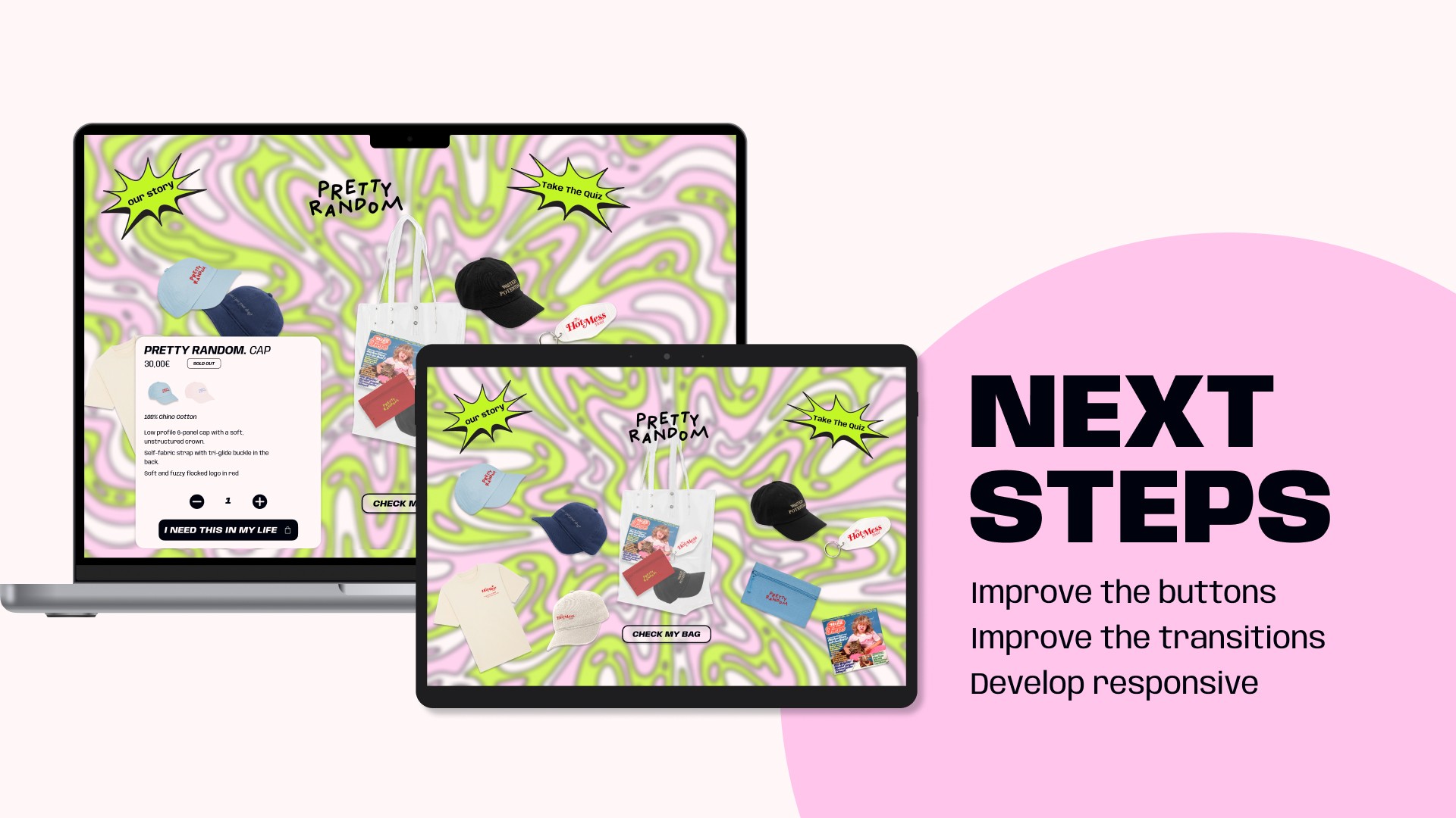
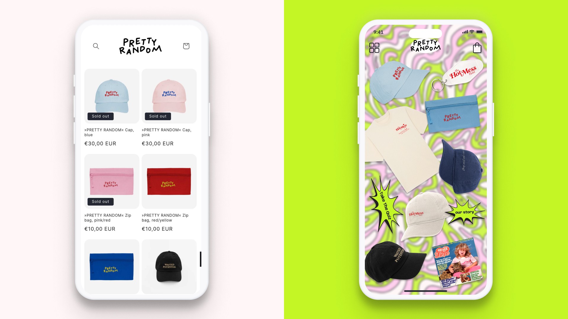
This was the riskiest design because we presented all the products at once in a broken grid with animations.
However, we also added an option to switch to a classic card grid view for users who preferred a more traditional product exploration.
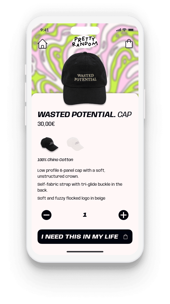
Purchase process
Although we wanted to create a fun, messy and silly experience, we did not want users to feel lost and confused in the decisive moments of the purchase process.
The selected items appear in a transparent tote bag so users can see what they purchase more visually.