Overview
This was my first official work experience and a truly transformative one. I had the privilege of co-founding a social entrepreneurship project, where I gained hands-on experience in building and managing a brand from scratch.
Scope
The scope of this project extended from 2018 to 2021.
As a result, the brand, visual identity and applications kept evolving during this time. Currently, Socaire’s team is in charge of updating and maintaining it. I occasionally come back to do more ambitious implementations.
My role
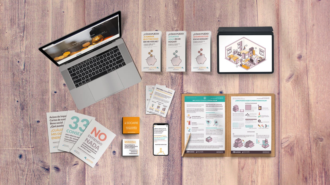
The original team initially contacted me to develop the identity of the brand, printed materials and website.
After graduating in 2018, I became a core organisation member as a design and communication manager for roughly 3 years.
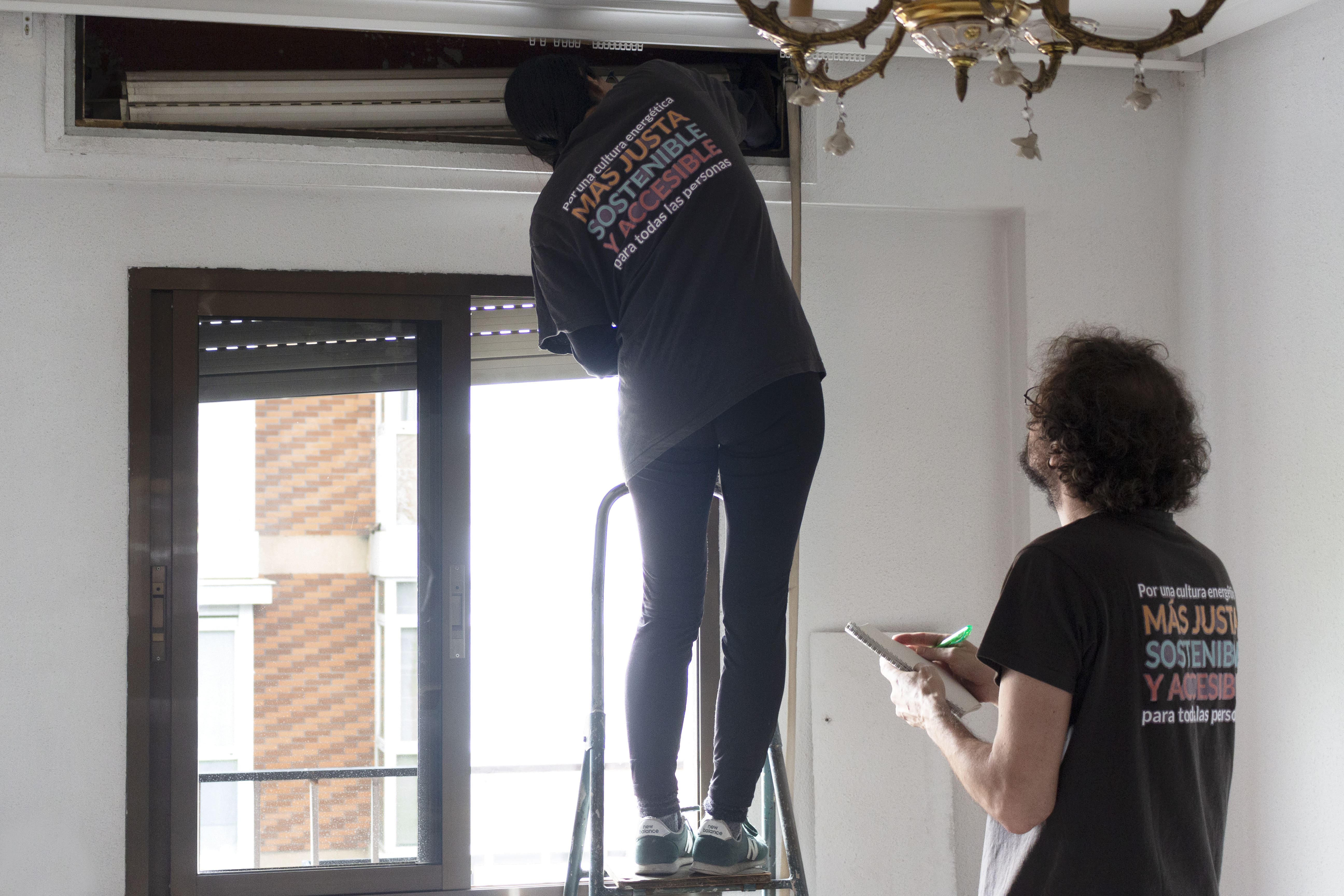
Meet Socaire
Socaire or al socaire is a Spanish nautical term that could be translated as lee, and it refers to the sheltered side of something, the side away from the wind.
Socaire is an asociation that seeks to fight energy poverty while promoting a more conscious use of our energy resources
Brand development
In its early stages (2017-2019), Socaire was part of Urban Innovative Actions (UIA), an incubator program by the European Commission that supports social entrepreneurship projects. Since the team was already receiving mentoring on branding, I was able to quickly understand their vision in our early meetings and build a branding proposal from there.
Value proposition
BRAND VALUE #1
We rely on equity, horizontality and transparency as our main tools
BRAND VALUE #2
As energy professionals, we promote closeness, mutual learning and complicity
BRAND VALUE #3
We encourage both single and collective empowerment through education and good practices
BRAND VALUE #4
We review our actions to nurture Socaire, our relationships and alliances
To actively encourage a thoughtful use of energetic resources while helping and empowering communities in vulnerable situations
Open-minded
Professional
Approachable
Young
Dynamic
Commited
Cheerful
Educational
Comprehensive
Fresh
Clear
Concise
Visual identity
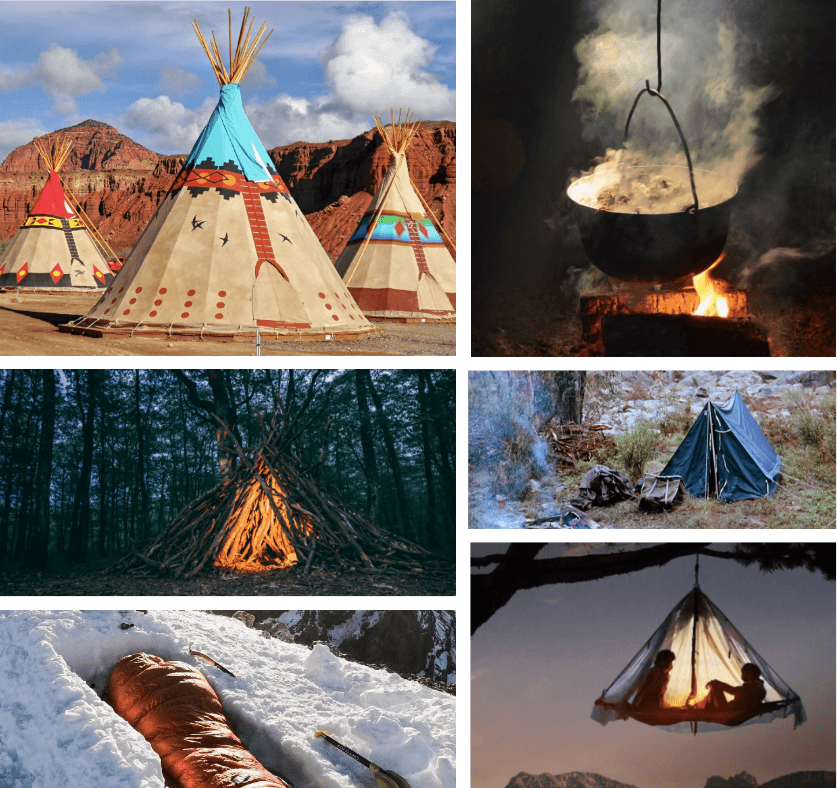
Although Socaire had already started developing its brand identity, I played a key role in driving the process of defining its visual identity. Building on the outcomes of the previous stage, we reached the concept of being cosy and comfortable in nature with minimal resources, which personally resonated with the team. Thus, the final logo became a simple yet meaningful representation of a fire or a tent.
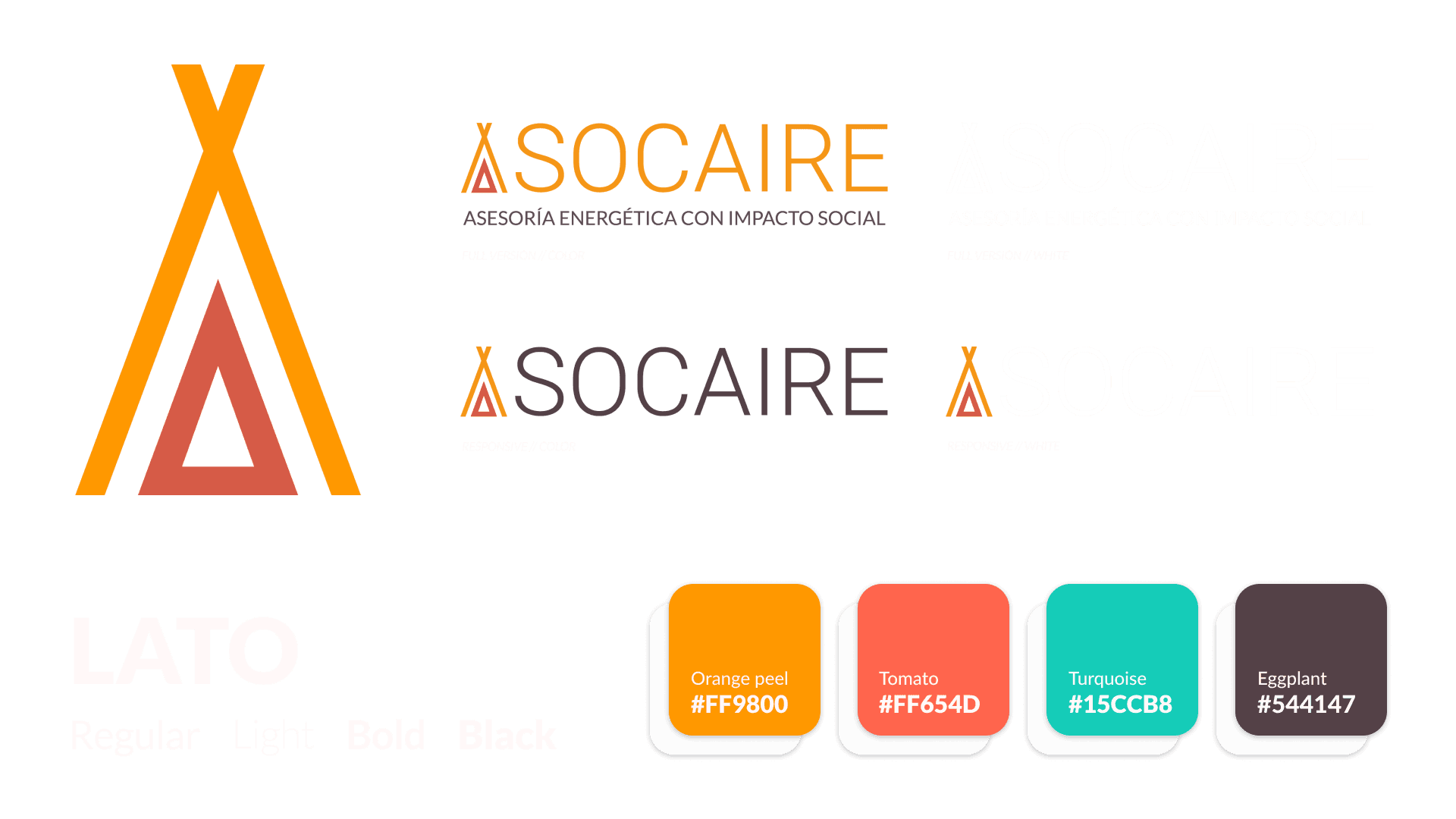
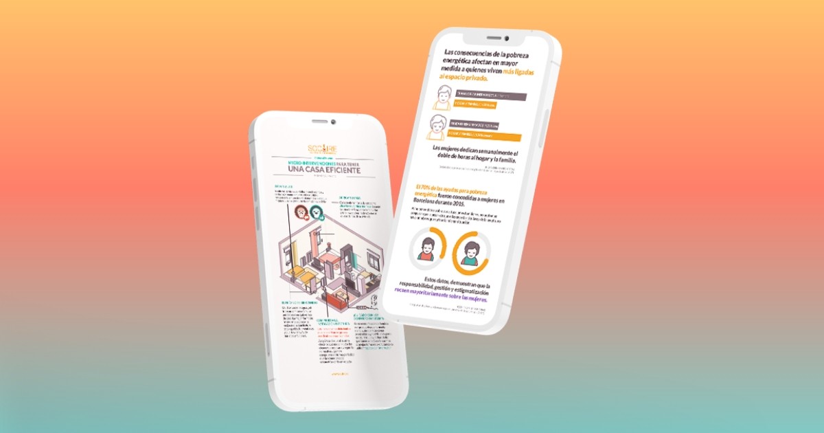
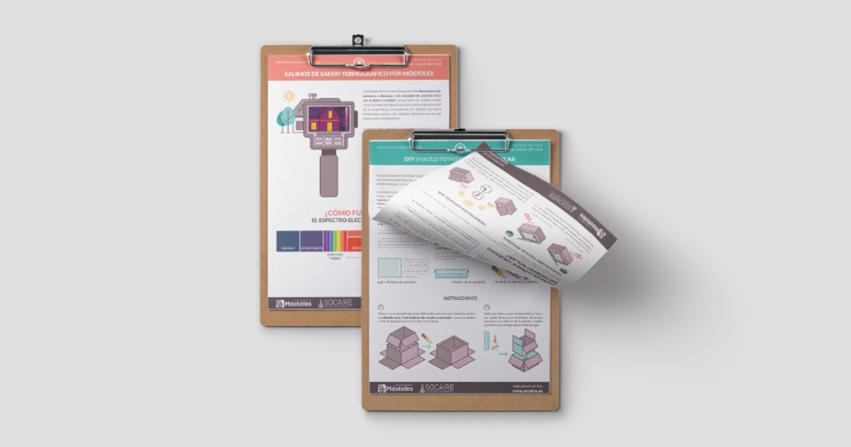
This system bring the brand identity and values to life, making content and communication more friendly, engaging, and easy to understand for clients, social intervention users and potential allies. They are color-coded, with different combinations depending on context and use. Here are some examples
Main color

Color combination

Monochromatic